|
|
||||||||||||||
|
Christchurch and District Model Flying Club |
|
editorial |
|
|
|
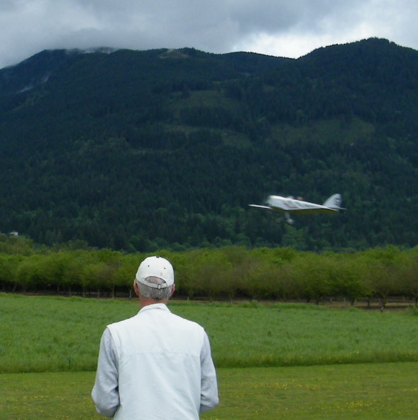
Many thanks to all contributors, and I hope you all keep writing for the magazine. Just a small request: when you go flying, take a camera! This issue is very short on illustrations and a good picture or two holds the attention far better than a page of words. Over the last couple of months a few of us have been working on making some of the Club activities and assets more fit for purpose. The website is being heavily amended to make it more informative, particularly for new members (we all speak in shorthandjust off to Longham - the Rosebowl will be held at Chalbury to which the only possible answer is ???) On that subject, I overheard someone say they thought the Club website and newsletter should be password protected. There are two answers why not - the simple one is that my software wont easily support it, but the one I really believe in is that its counter-productive. Nowadays, information is pretty well free, and any site that puts up barriers risks losing readers. Ive been told so many times that I read about your Club on the website that Im all for keeping it that way. There has also been a lot of thought given to flight discipline and basic safety. As a Club we are not good at this. You'll have seen fliers wandering around the field or standing in front of a spinning prop or chatting idly to a pilot when he is flying. And these were just the other day! Communication is another area where progress is being made, with Google Groups offering a free messaging and discussion service to all of us. It needs some fine tuning perhaps, but has the potential to replace bulk emails. Finally, what has happened to Goudy Stout? Its my favourite typeface for headlines and as it is only available in upper case, is ideal for the task. But on my laptop, it comes out as lower case and looks as if I have not been paying attention when typing. So Im trying stencil instead, which is appropriate for a model-maker, as it looks so much like serial numbers, random lettering and so on. Mike |
|
[Home] [Chairman's Chatter] [Editorial] [Profile Terry] [Muddy Puddles] [Fly Diary] [Novice year] [AcroWot] [Caption Comp 1] [Caption Comp 2] [Andrew's Depron] |
